

Previous project
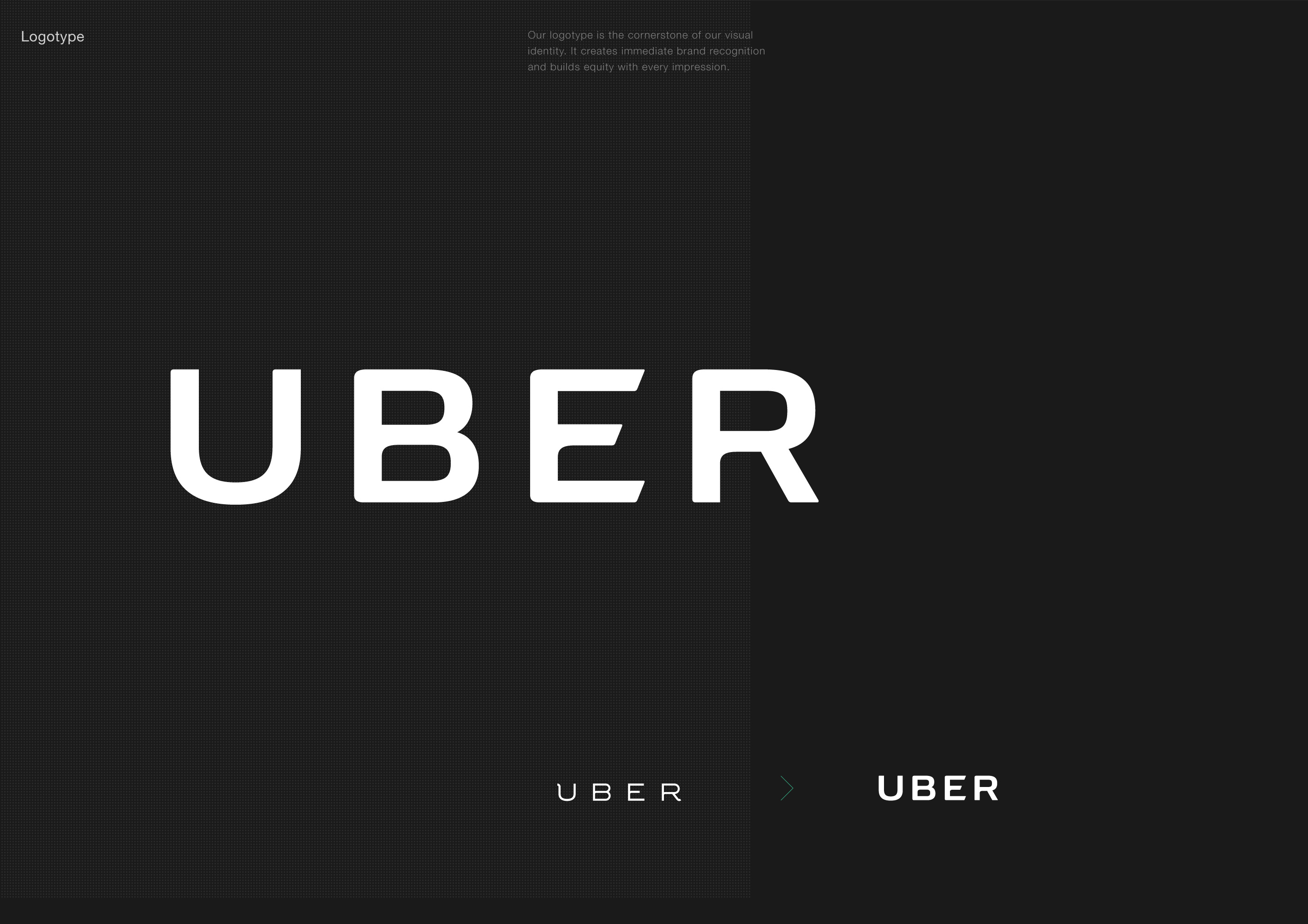
Uber Rebrand: Logotype

Working as a Lead Brand Designer at Uber, Roger Oddone was part of the team responsible for the 2016 rebrand.
Visual identity
Creative Director: Shalin Amin
Lead Brand Designer: Roger Oddone
Designers: Bryant Jow, Catherine Ray, Donald Wong, James Bamford, Lian Ng, Matt Riley, Mirtho Prepont
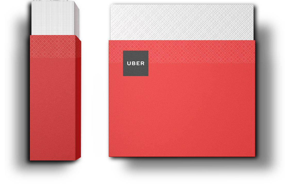
Thank You Cards
Designer: Catherine Ray
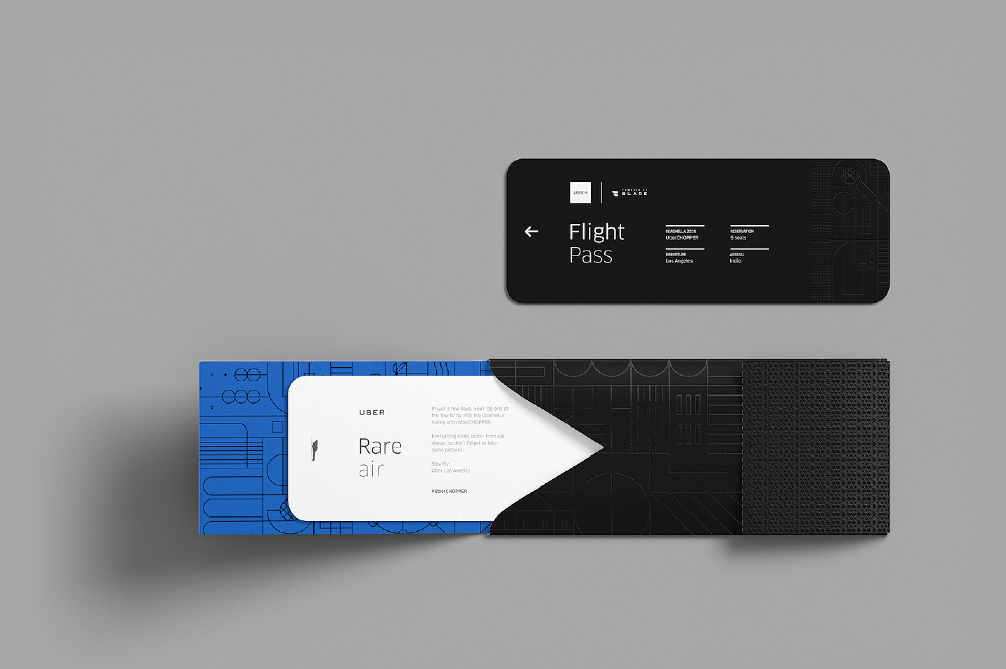
UberCHOPPER Tickets
Art Director: Jeremy Perez-Cruz
Designer: Jessica Duong
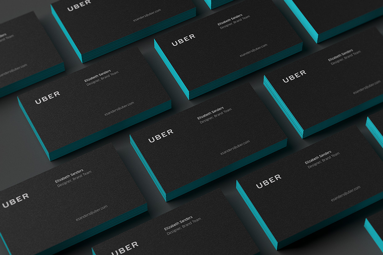
Business Cards
Designer: Catherine Ray
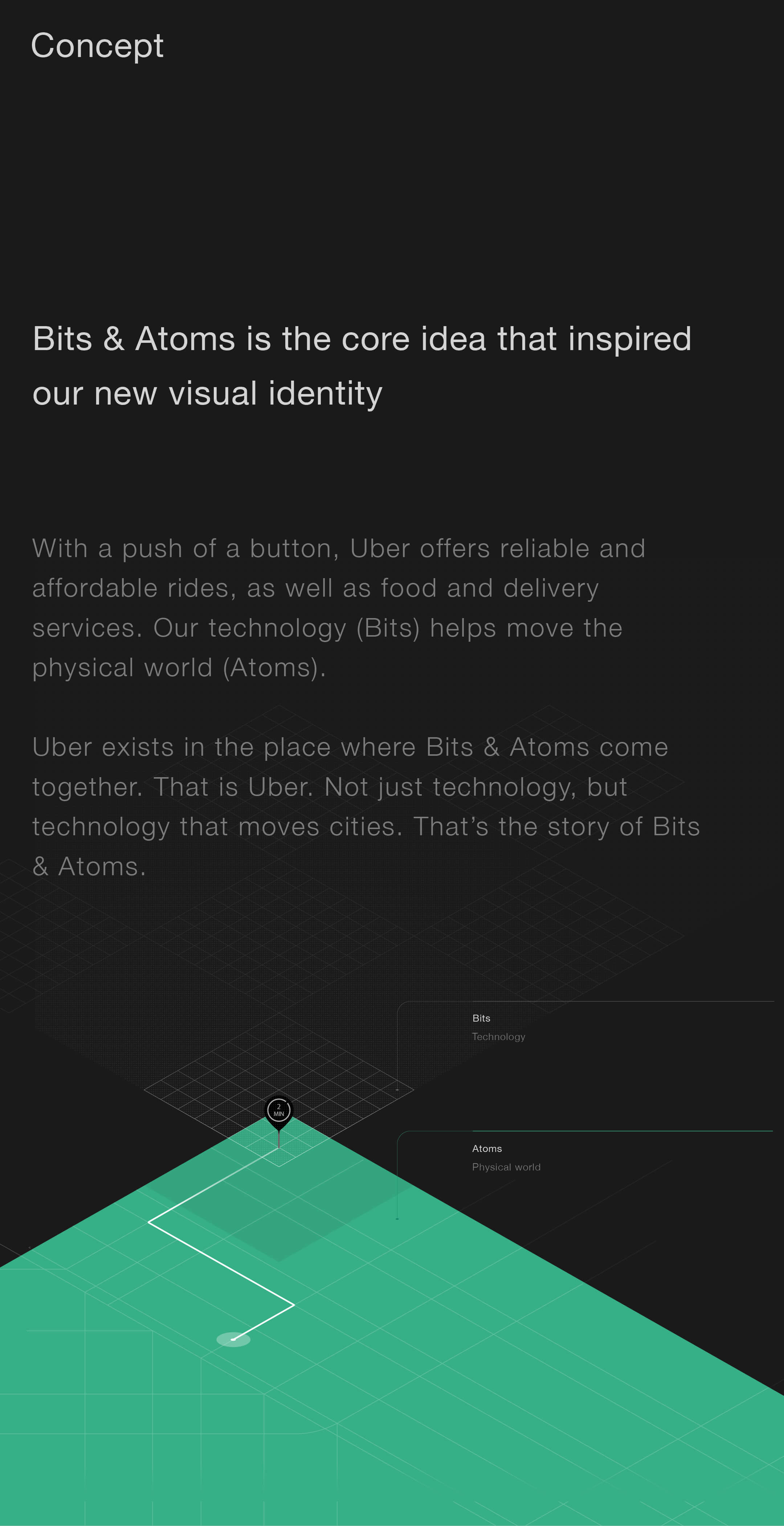
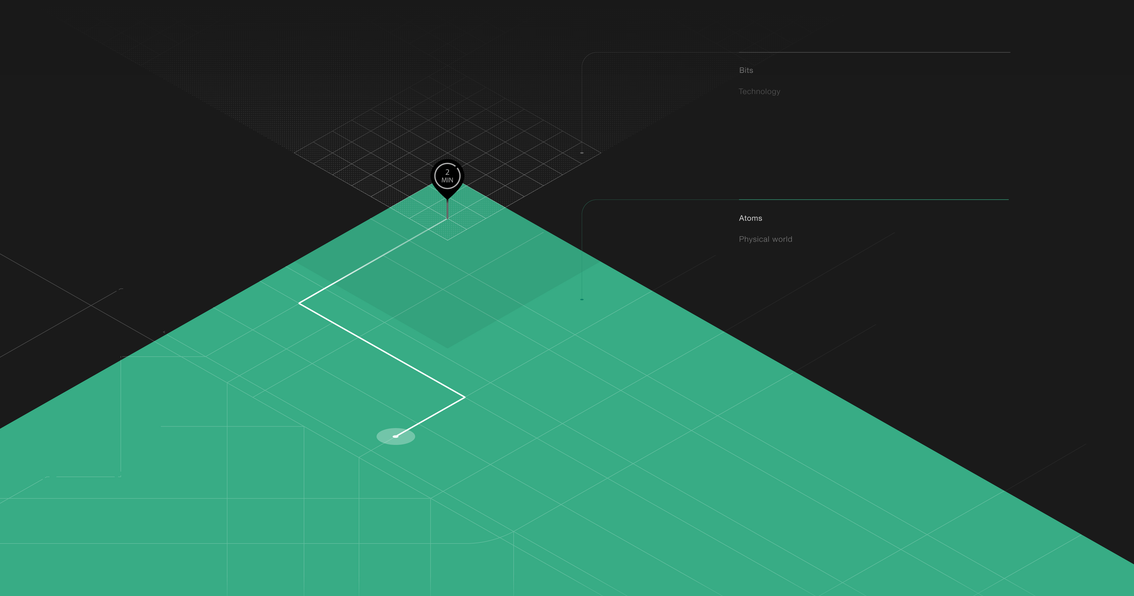
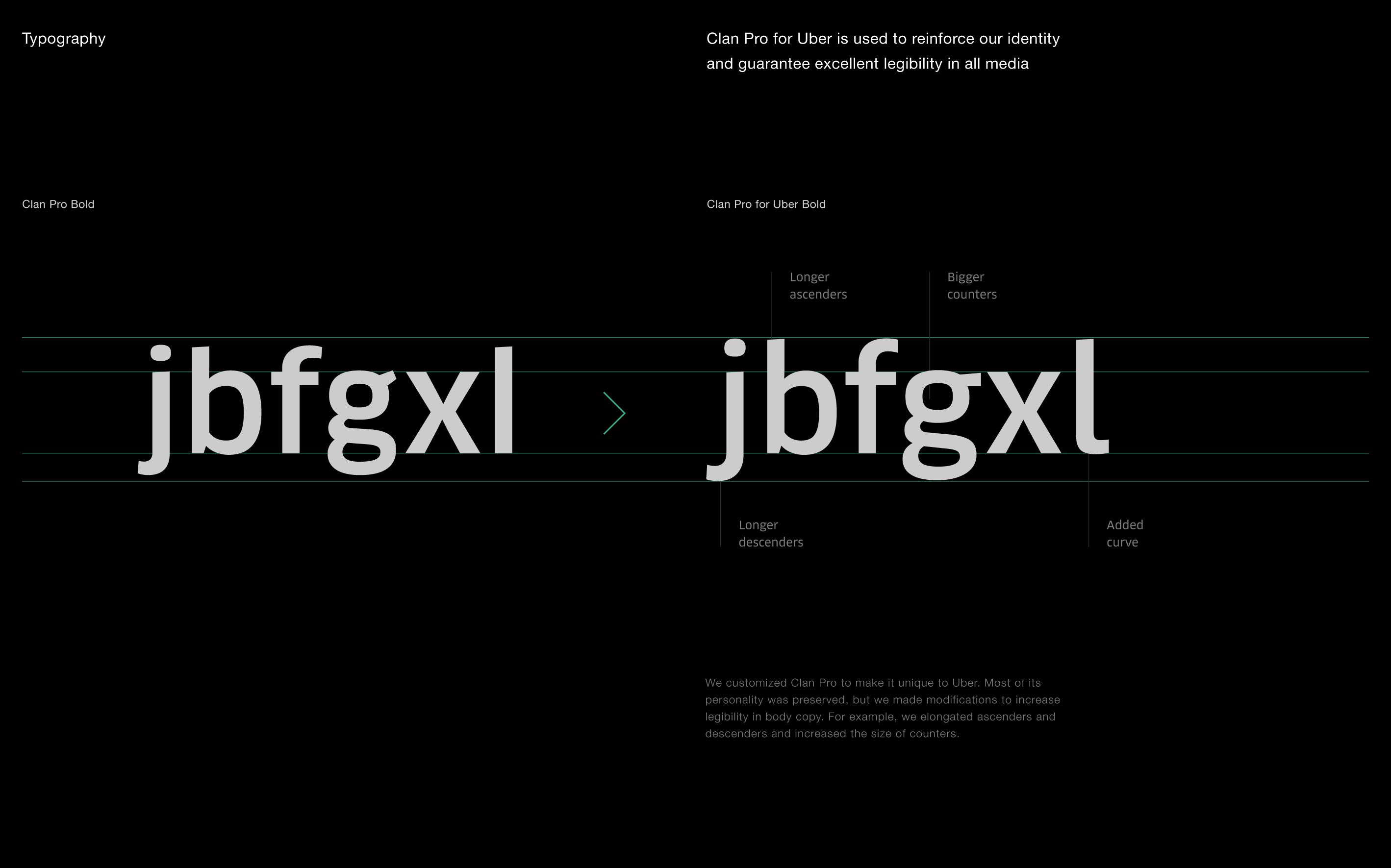
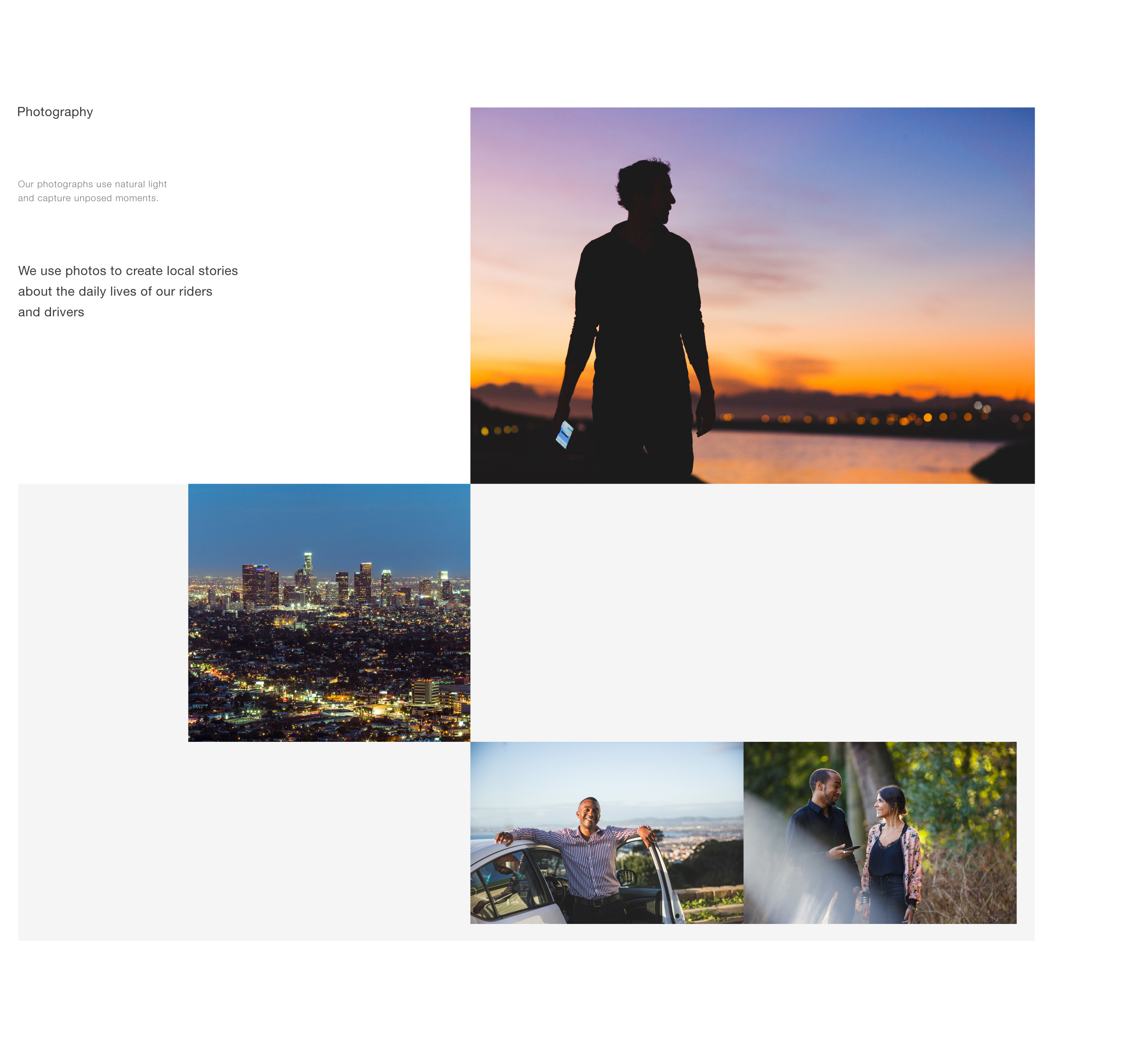
Uber began six years ago as a way for 100 friends in San Francisco to get luxury rides—everyone’s private driver. Today, it is a transportation network spanning 450 cities in 70 countries. That network delivers food and packages, as well as people, all at the push of a button. It became clear that a limited set of visual identity components was not enough for Uber to engage with its different audiences.


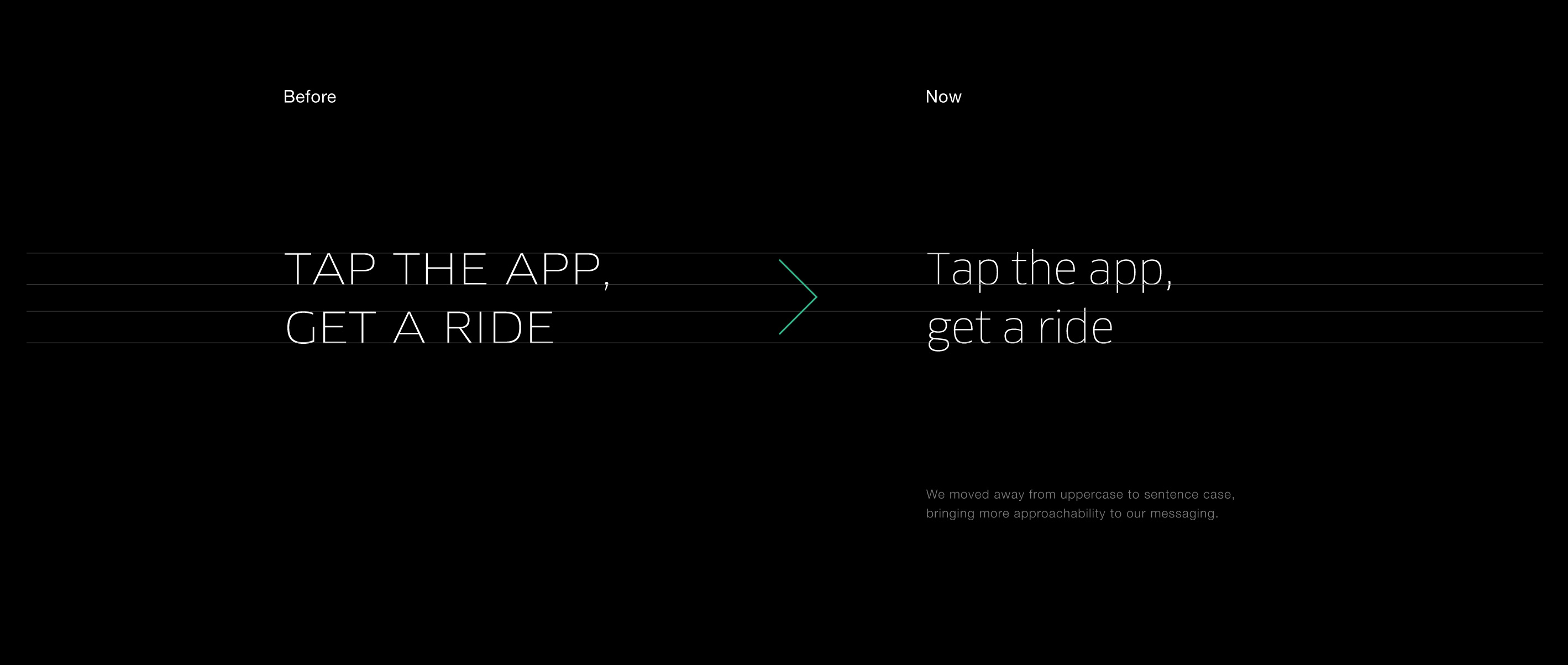
Just like with its products, Uber is always revising, testing, and evolving the components of its visual identity. This exercise helps keep Uber’s communications fresh, inspiring, and relevant for its audiences.

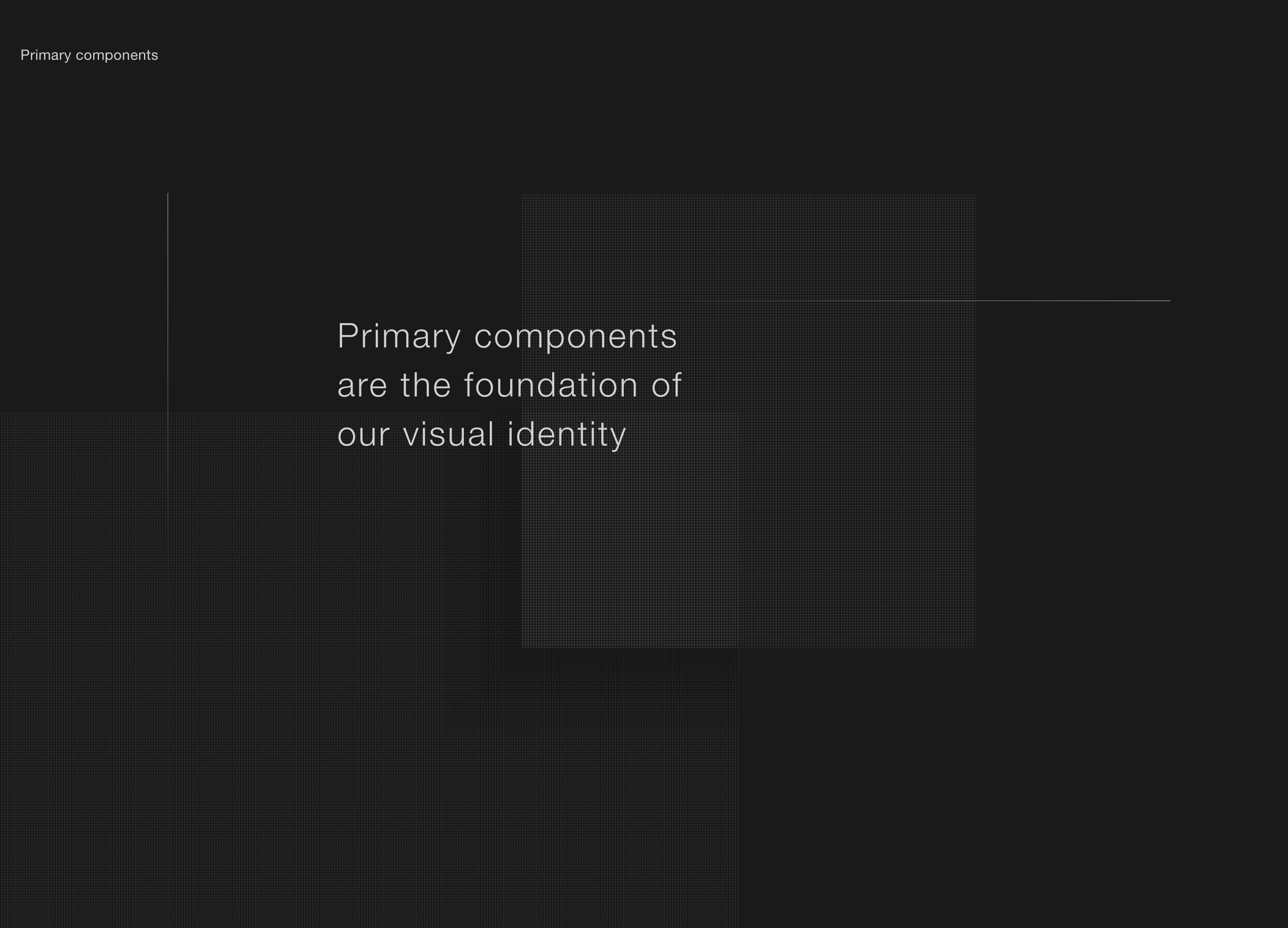
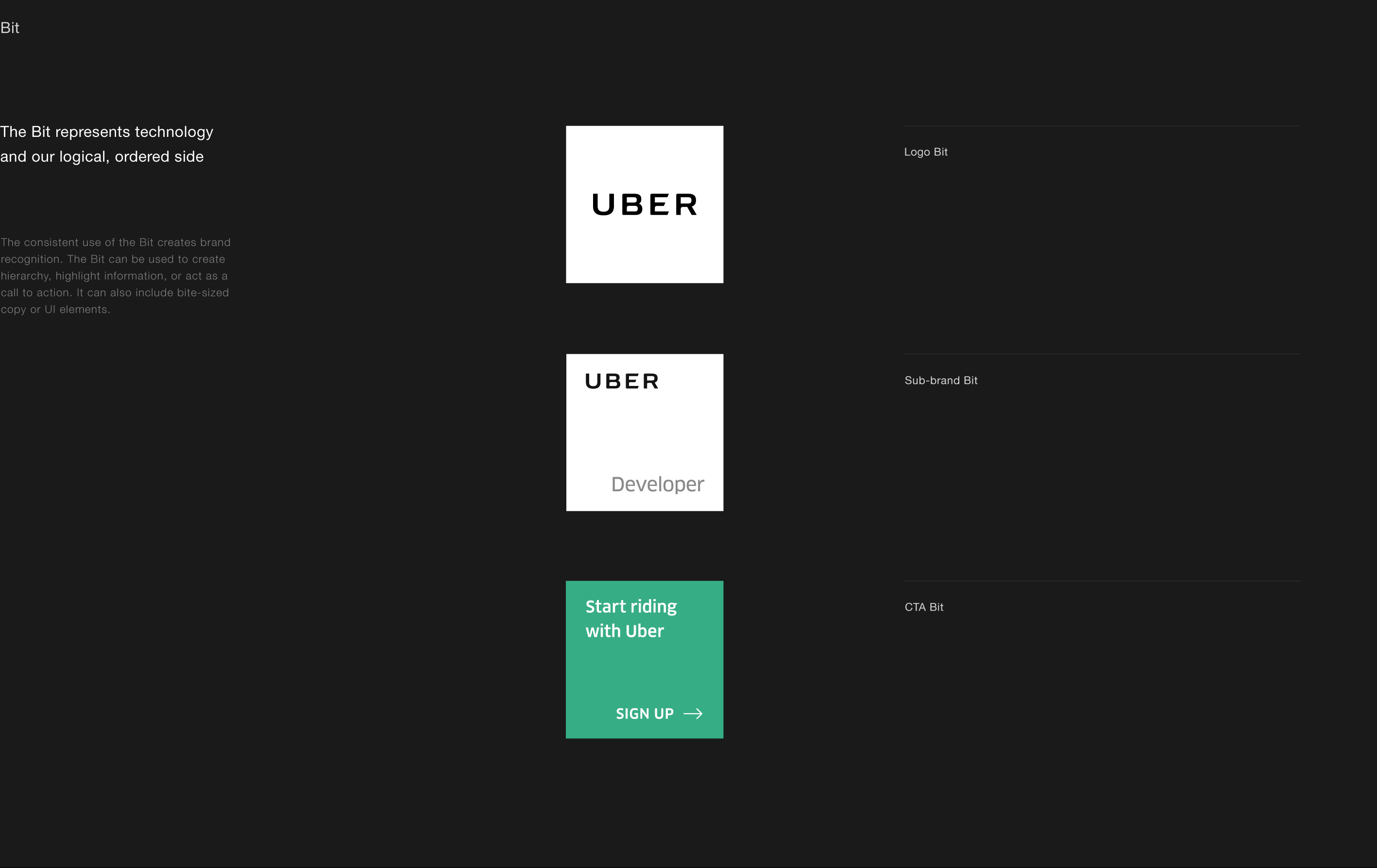
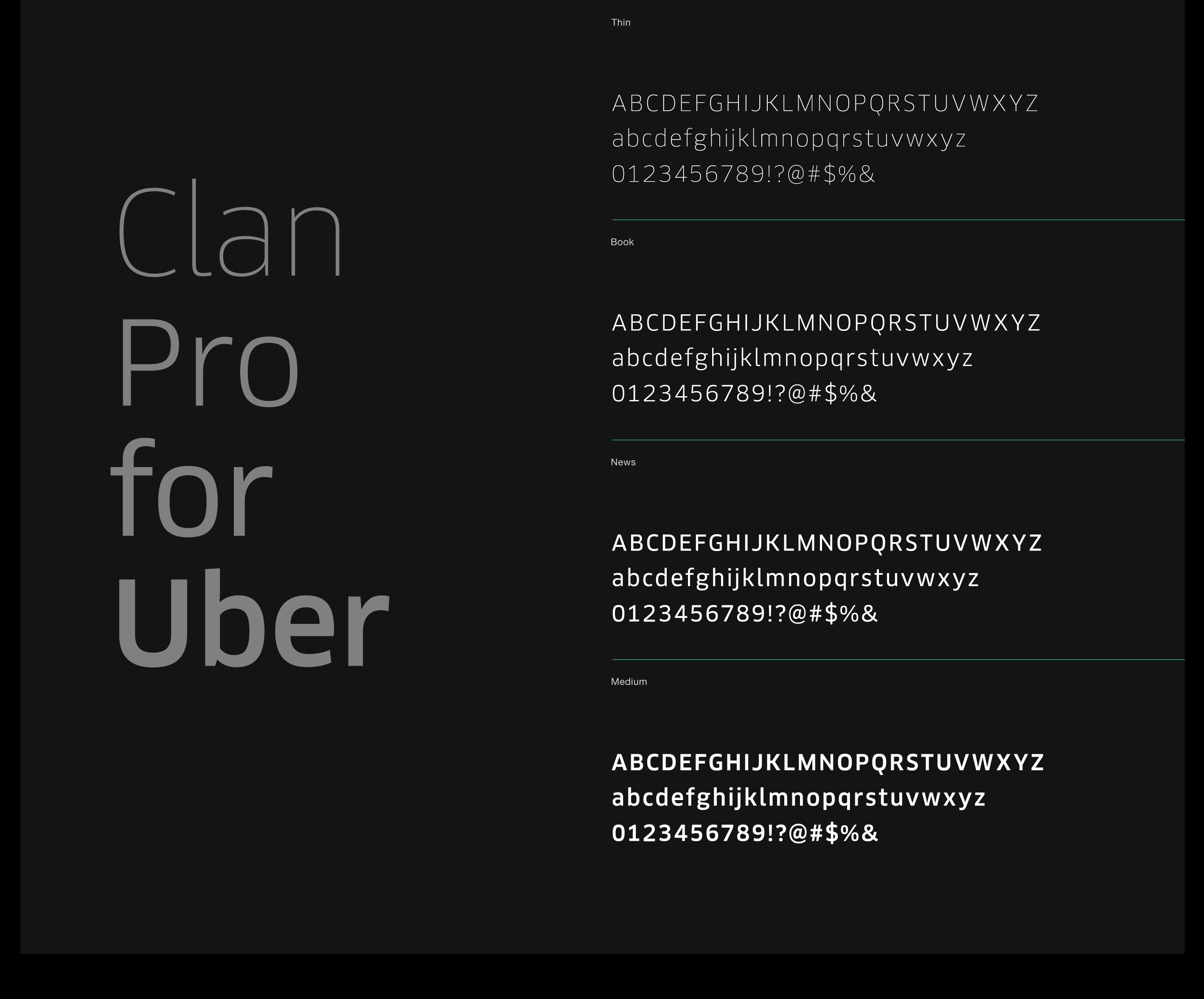
The visual identity caters to Uber’s complex needs as a brand at every touch-point. It’s made up of primary and secondary design components.
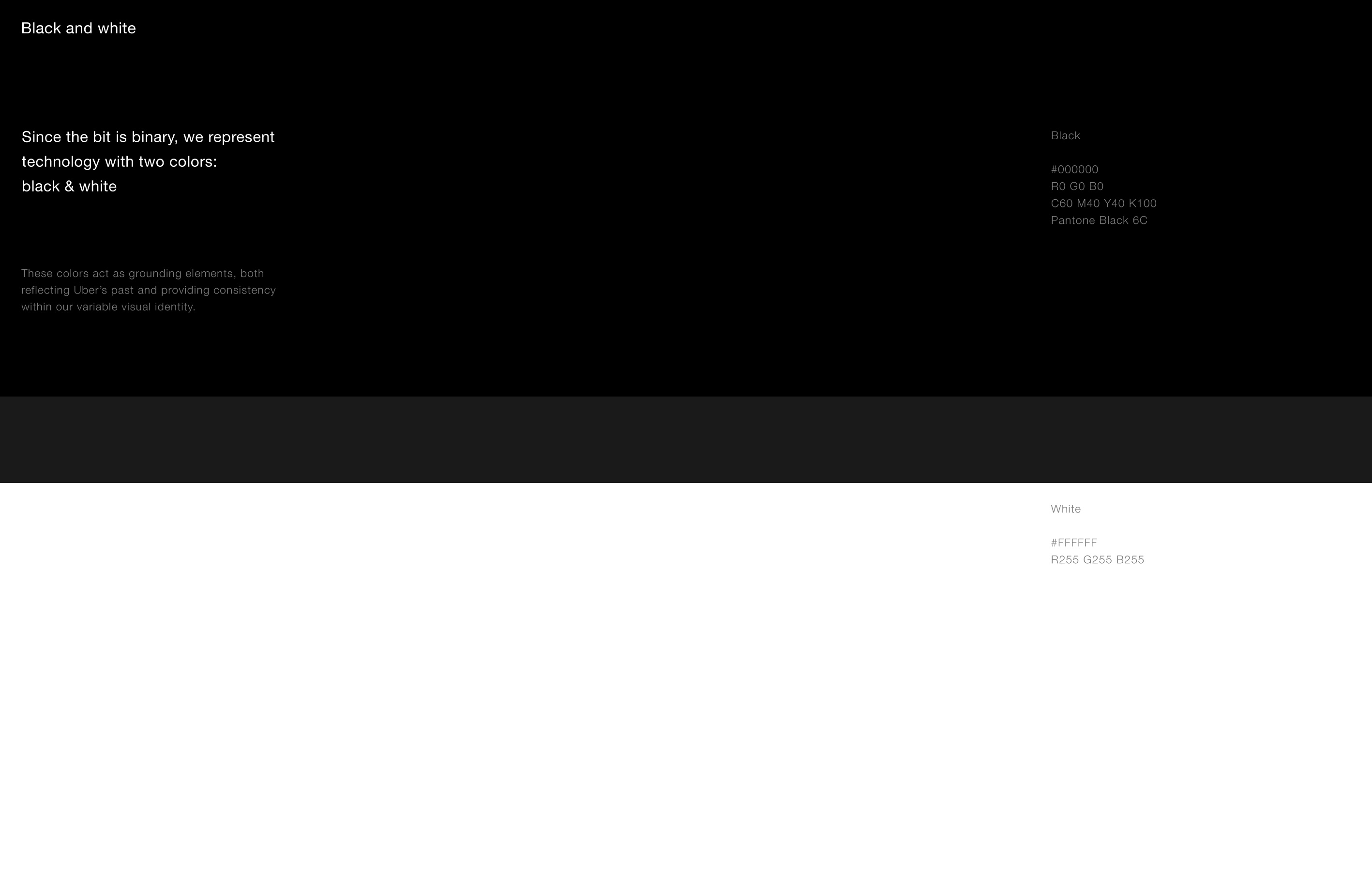
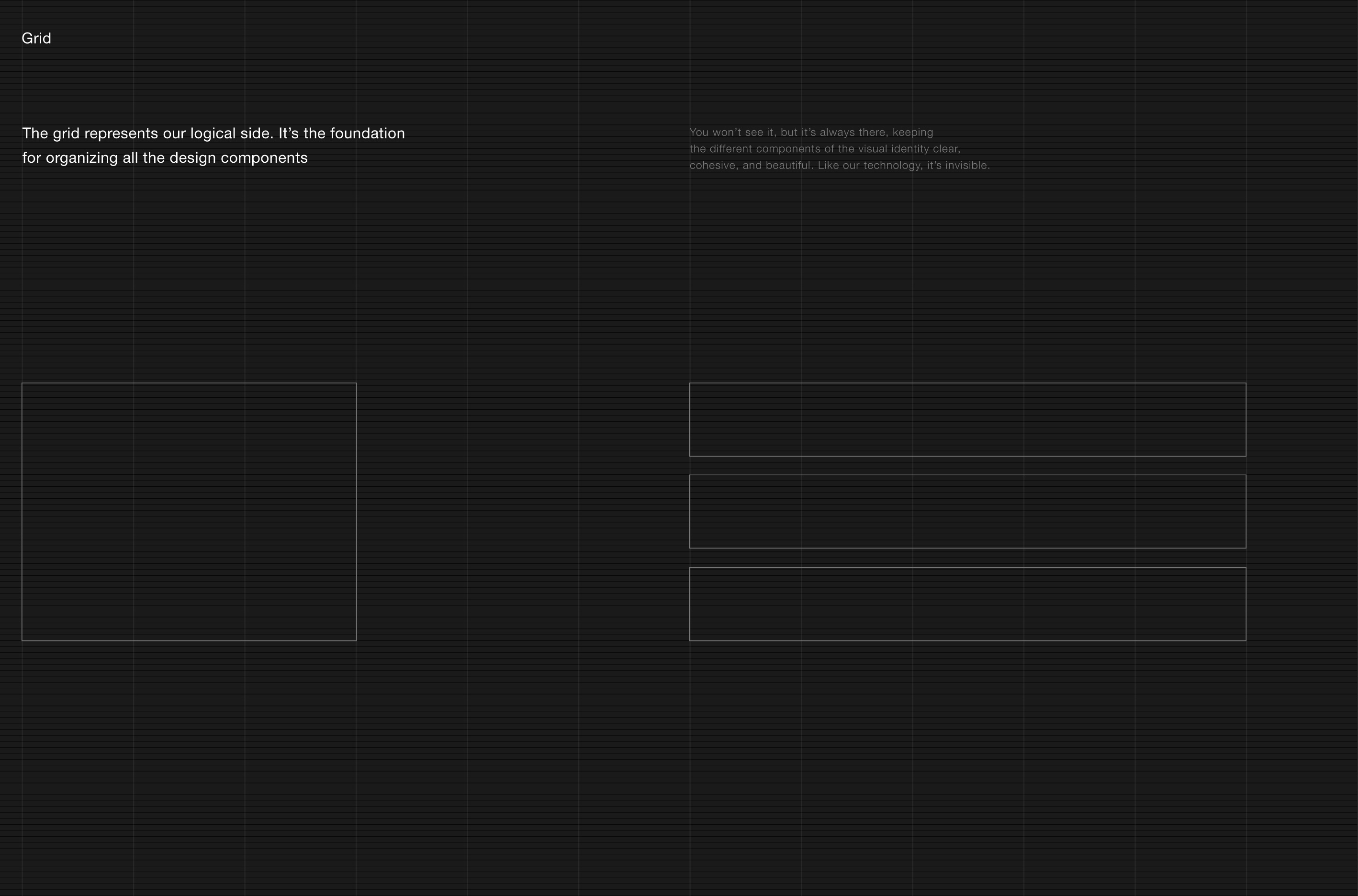
These are the foundation of the visual identity. They lean close to the Bit, their logical side, and create consistency across the brand visual expressions.


Secondary components
These provide flexibility and allow for localization, keeping the system fresh and dynamic. Secondary components lean closer to the Atom, representing the physical world.


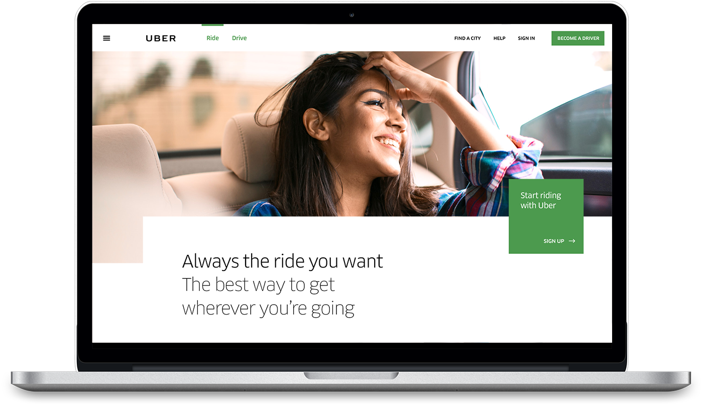
Website
Thank you cards
UberCHOPPER tickets
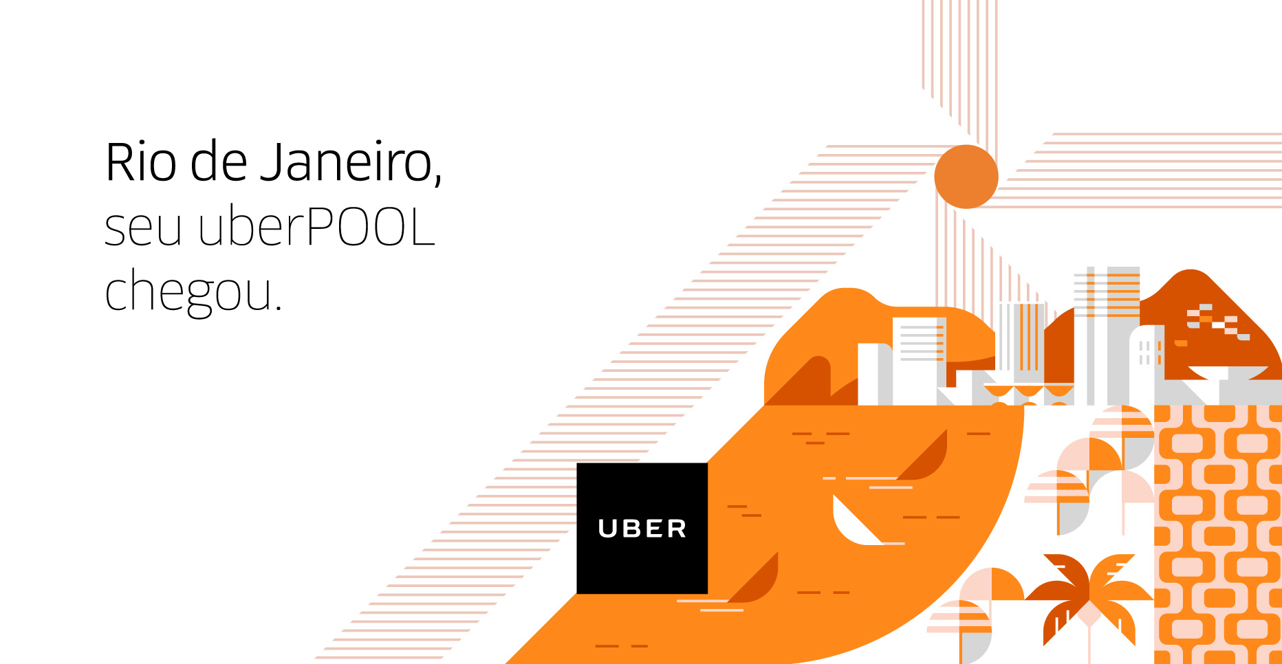
Billboard example
Business cards