Previous project
Uber Rebrand: Visual Identity Framework

Working as a Lead Brand Designer at Uber, Roger Oddone was part of the team responsible for the 2016 rebrand.
Creative Director: Shalin Amin
Lead Brand Designer: Roger Oddone
Design Manager: Strahan McMullen
Designer: James Bamford
Designer: Catherine Ray
Designers: Donald Wong, Casey Edgeton
Designer: Karen Chiu
Design Director: Didier Hilhorst
Art Director: Mirtho Prepont
Designer: Richard Donnelly
Update Uber's logotype to reflect its evolving brand, as well as increase the visual weight of the previous logotype, which wasn’t legible at smaller sizes.
The logo is presented in two versions: the logotype or the Logo Bit. Their use is interchangeable.

To create consistency, the logotype is always used in either black or white. Grey is used with our sub-brands.

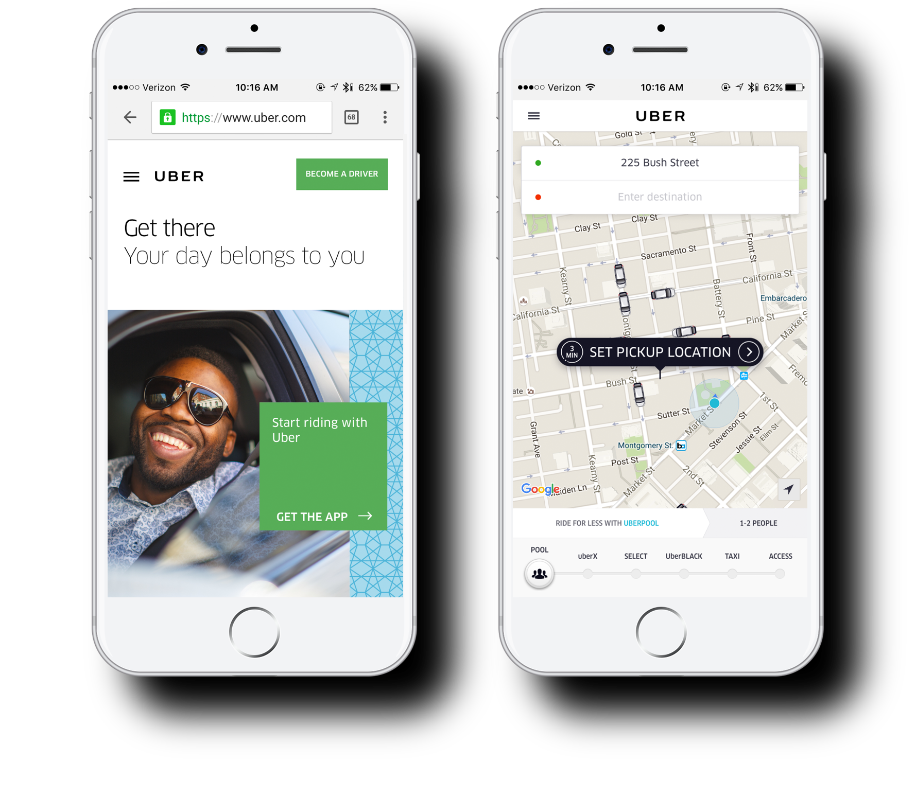
Website
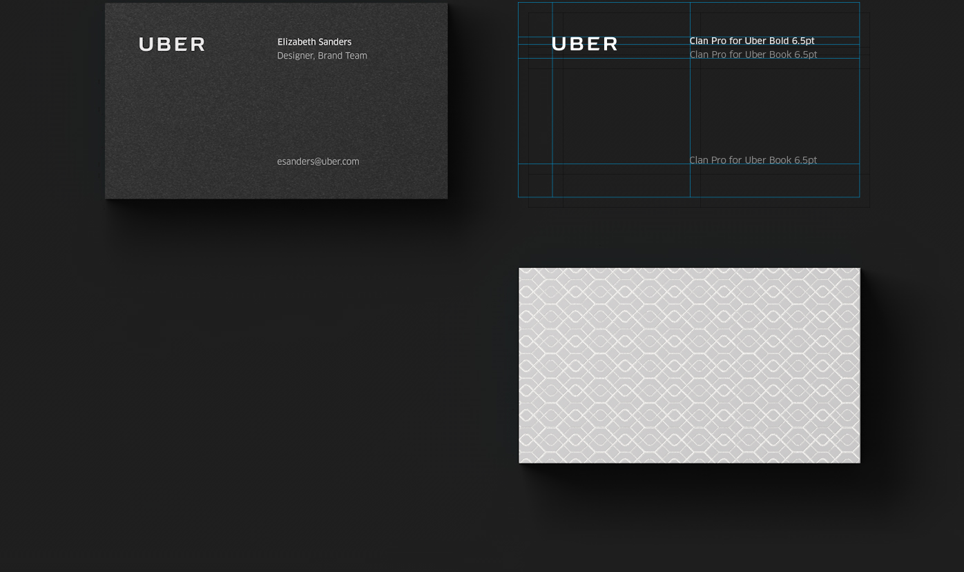
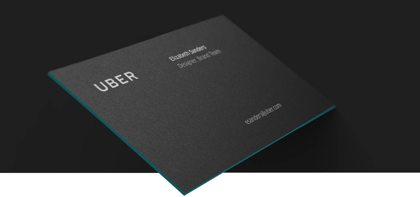
Business cards
Environmental
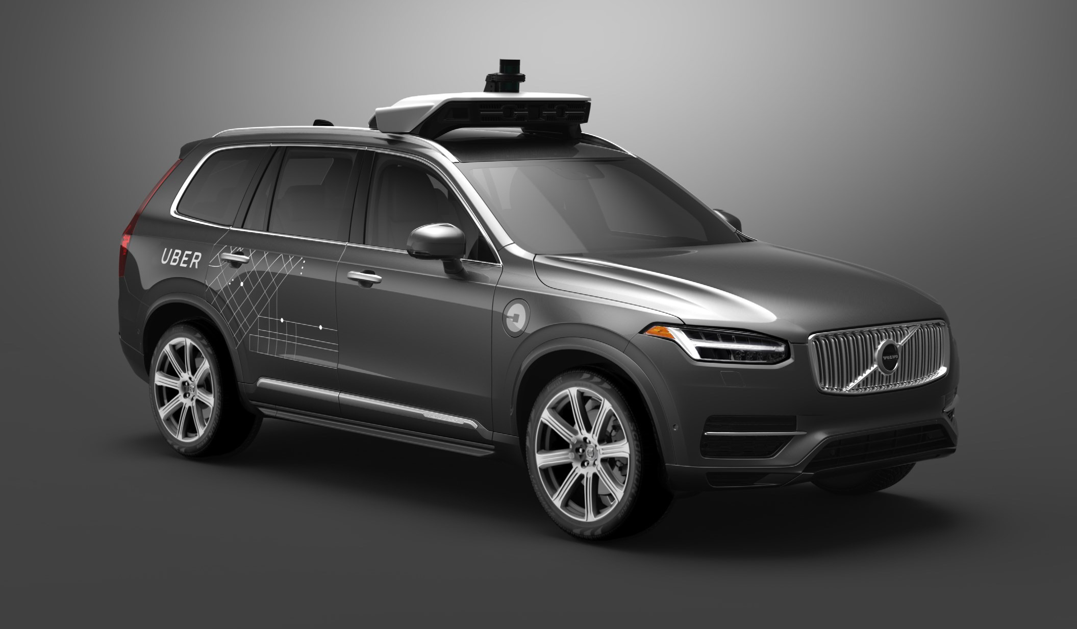
Uber Autonomous
Vehicle Artwork